

Redesign the Planespy app to make useful information more accessible, implement timely & relevant notifications, and acquire amenity data from users.
Traveling can be a very stressful experience. You've navigated through the crowds of people, made it through security and finally get to your seat only to discover there's no Wifi access or power outlets on this plane. A multi-hour flight just became that much more frustrating because you didn't know to prepare accordingly.
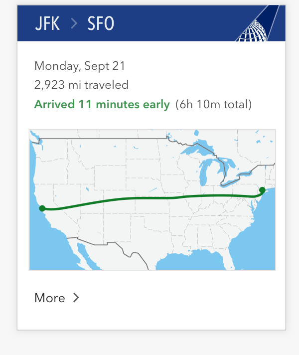
But knowledge is power. Planespy helps flyers be prepared for their flight with in-depth info of their plane before they even get to the airport.
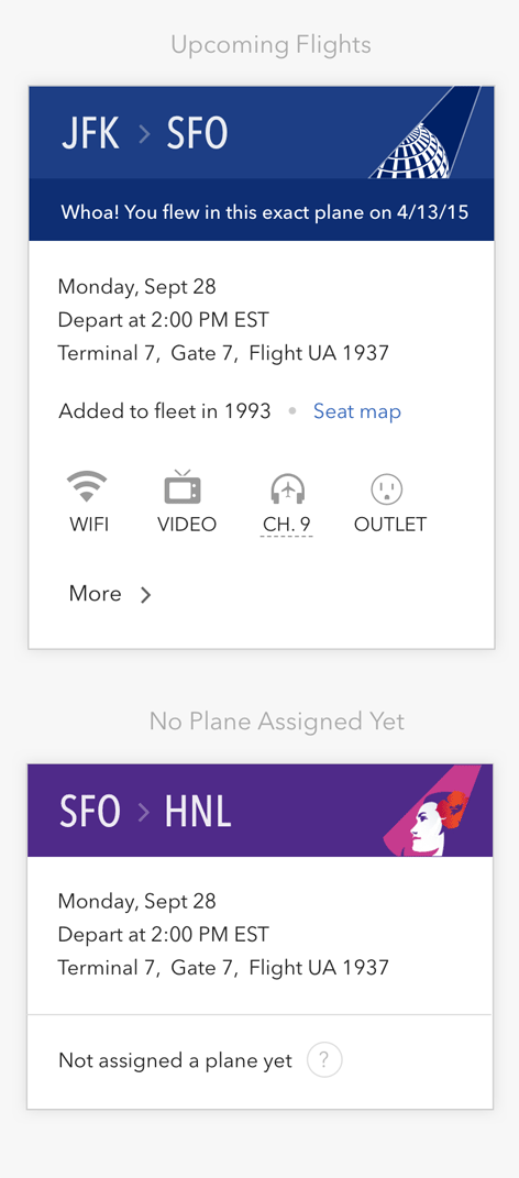
Planespy bases its information on the Tail ID, a unique identifier of the plane. Based on this ID, Planespy knows the model, layout, amenities, remodel year, and other characteristics of the plane. It also enables Planespy to celebrate fun facts like if you've flown that exact plane before.
Evaluating the existing app, I observed a couple of issues. Amenity information, the primary value proposition of the app, was concealed behind an accordion interaction. Additionally, the table layout pushed that info below the fold. The presentation was also drab and muddy.
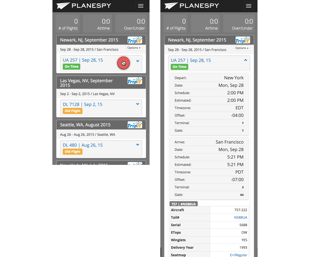
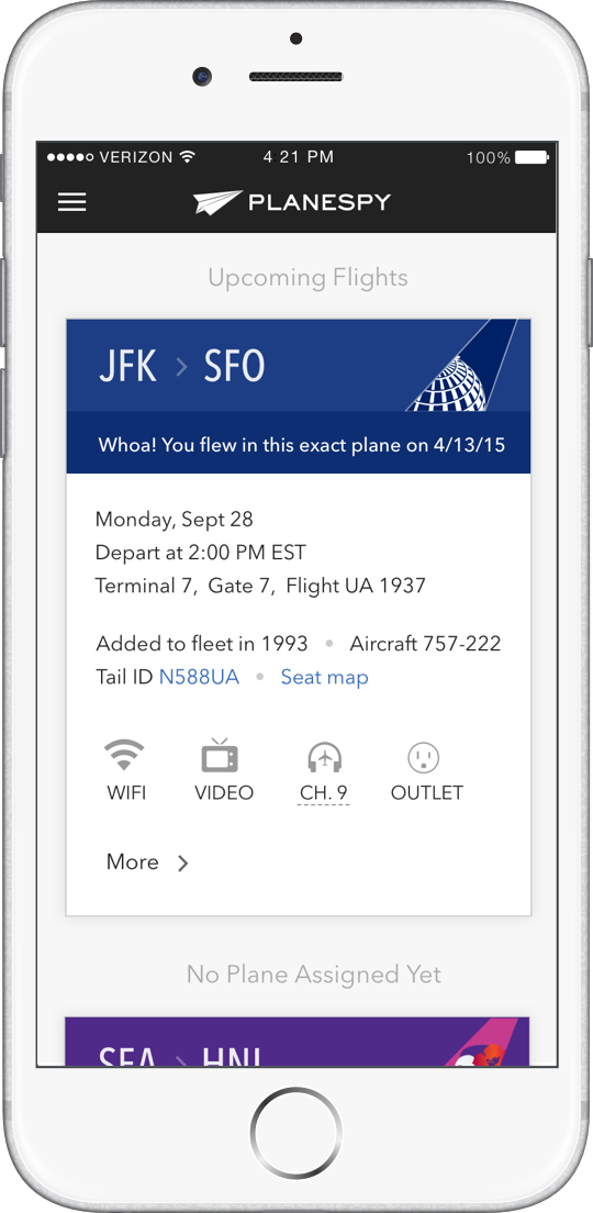
I began by mapping out low fidelity wireframes and exploring card layouts that displayed amenity info at-a-glance. We wanted to retain a brief flight summary for reference while providing plane details. The addition of icons made amenities more scannable.
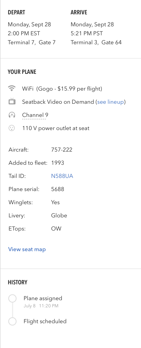
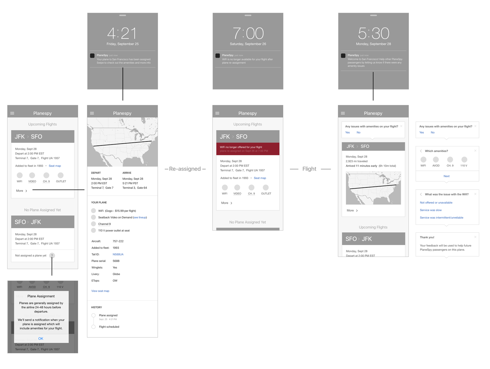
Replacing the accordion with a full page afforded more room to structure the content neatly and enabled deep linking from notifications.
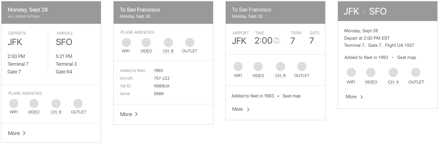
We brightened the app to add more contrast against the charcoal branding. We also incorporated color and vitality through airline branding on the cards.
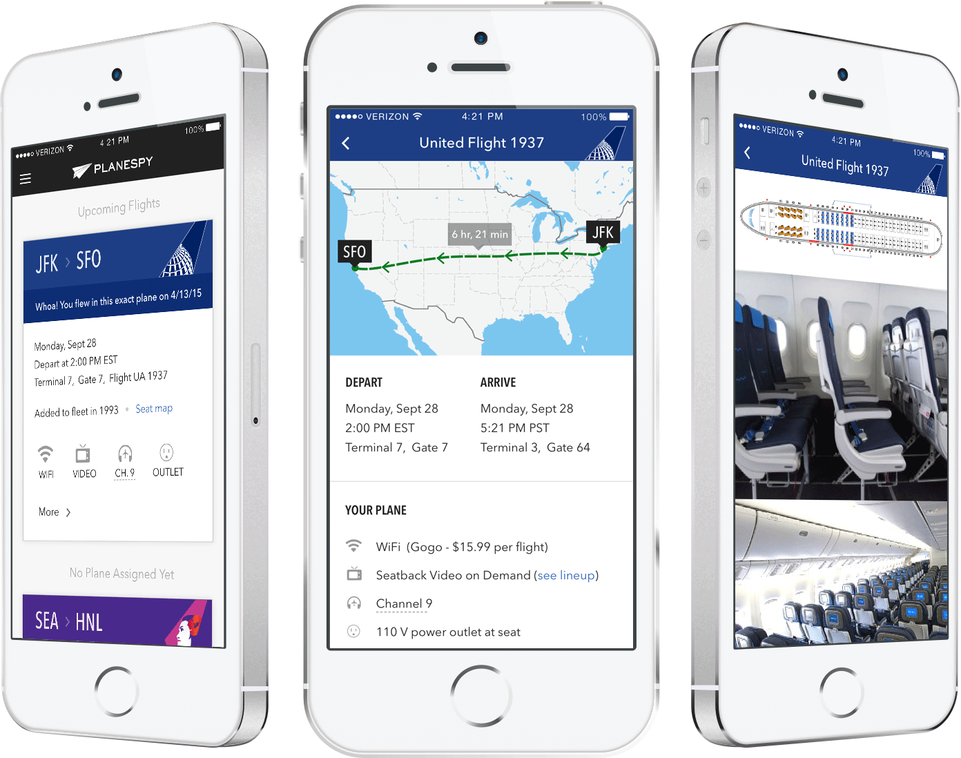

Because most of the data is derived from the Tail ID of the plane, the tail is incorporated as a colorful pop in the styling of the cards.


If enough users have voiced concern, Planespy can then send a soft warning to any user who is assigned that plane.

 Which amenities?


 What was the issue with the Wifi?