
Increase Wish List engagement and sales with a modernized redesign on desktop and mobile web.
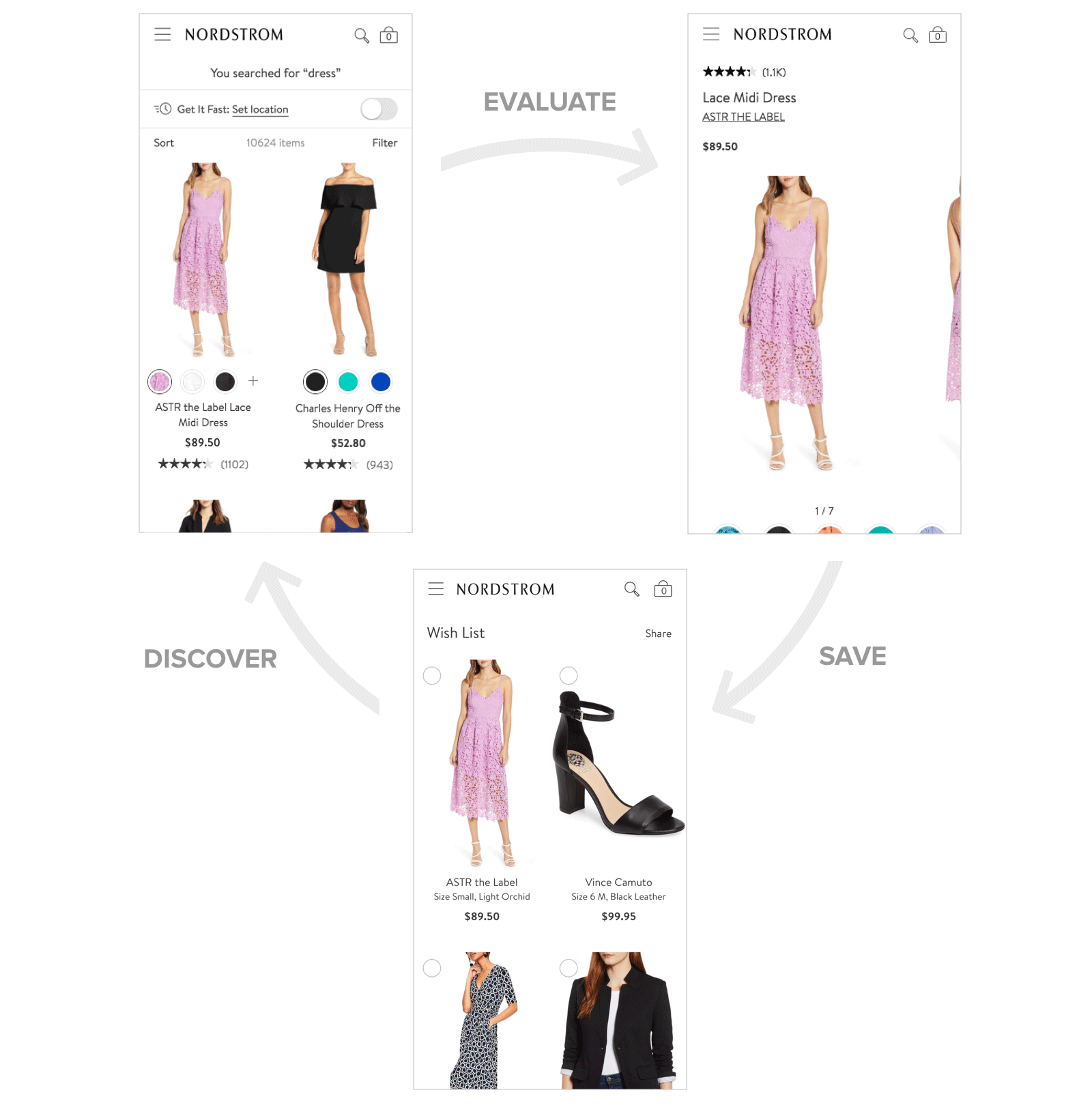
During their shopping journey customers sift through many options, usually across multiple searches. Wish lists are a great tool for customers to collect items they're interested in. It's also fun to dream a little and create a list of "maybe one day" aspirational items.
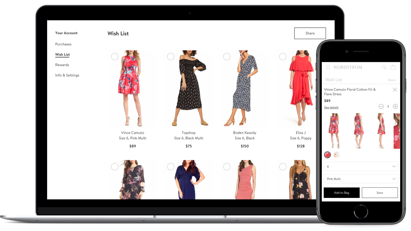
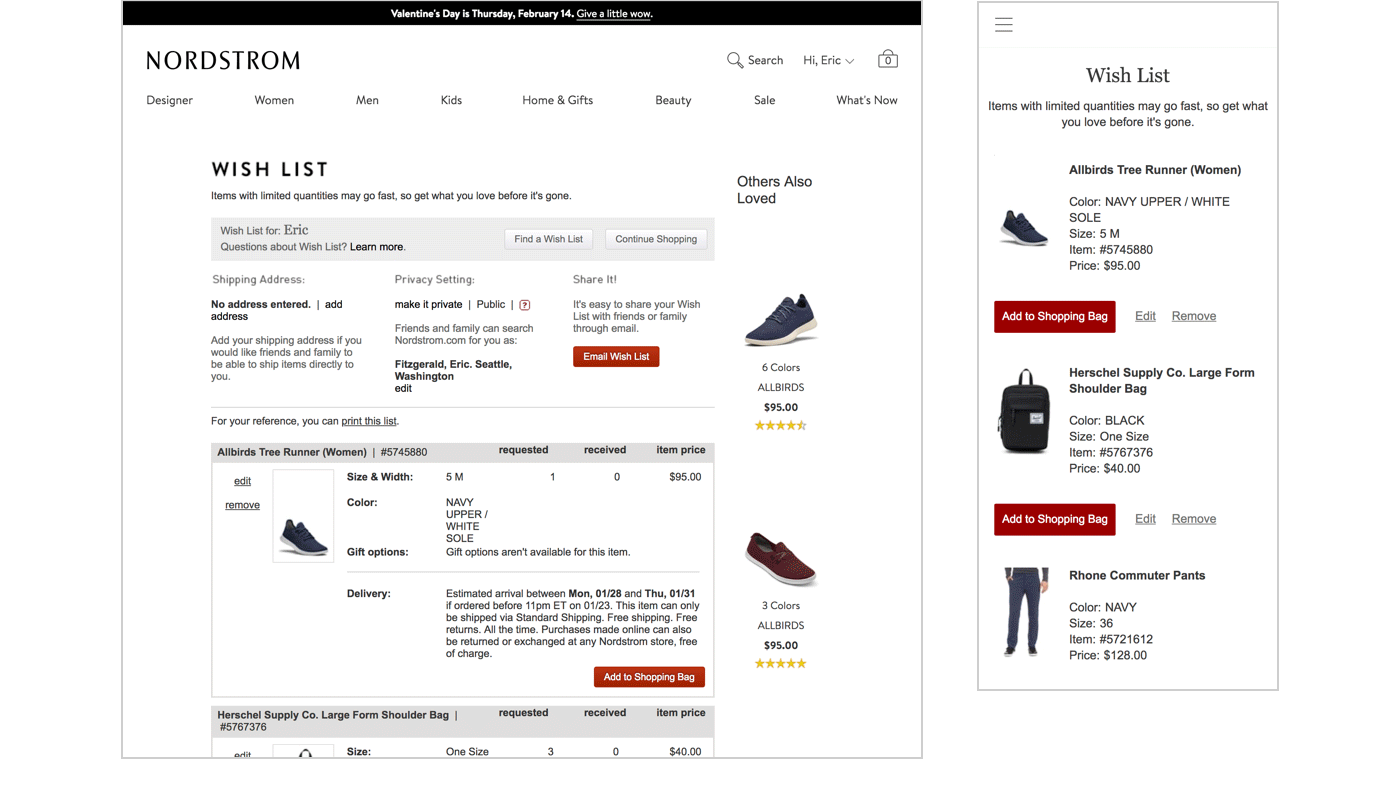
But the existing Nordstrom Wish List experience was underinvested in and hadn't been updated in years. The layout was cluttered, managing items was a chore, and sharing to friends and family was confusing.
My team and I identified an opportunity to re-evaluate the experience to deliver more customer value and drive more sales. Getting started, one of the largest challenges with the project was the lack of available data. The page was created long ago and much of the page engagement and purchase tracking was never implemented.
To minimize this gap, we leveraged customer interviews and database metrics to understand existing Wish List usage. Working closely with my Product and UX Research partners, we identified some trends:
- Shoppers found saving functionality useful and often had wish lists across many sites and services
- Many Nordstrom lists had a high percentage of items no longer available and removing them was a chore
- There was a high rate of list abandonment within a year of creation
- Sharing functionality had low usage. Customers were interested in this feature but were confused by public vs. private lists
- The styling and presentation was cluttered and inconsistent with the rest of the site
In addition to addressing customer concerns, our Engineering partners sought to rebuild a more performant, scalable backend for the feature. We would also integrate the front end into our sitewide UI component library.
I organized a kick off with the team to review our research, propose some experience opportunities, and align on our goals.
Based on customer feedback, I developed some customer statements to help guide our feature development within our MVP scope:
- Make it easy to save items I'm interested in
- Make it easy to access, edit, and remove saved items
- Make purchasing clear when I'm ready to buy an item
- Allow me to easily share my Wish List with family and friends
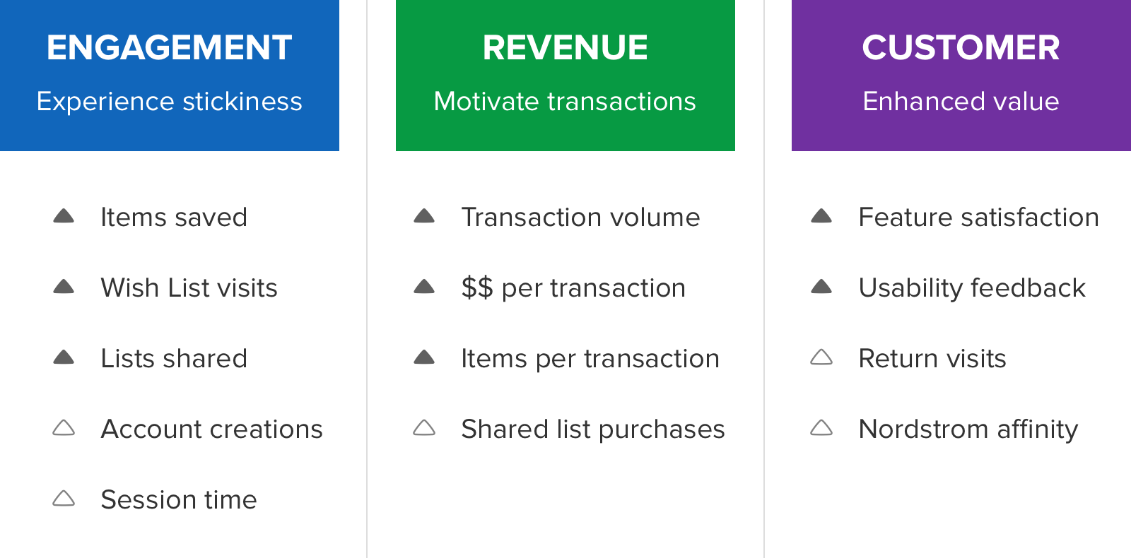
Additionally, I proposed KPIs across Engagement, Monetization, and Brand as well as important metrics that Wish List could have softer influence on:
Over the course of our feature development, I built a hand coded jQuery prototype that we used to evaluate ideas and interactions as well as get feedback from users. Scale the browser width to responsively see the desktop and mobile web experiences. Try it out for yourself!
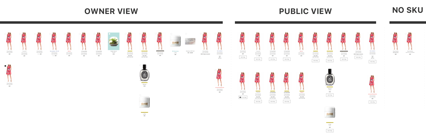
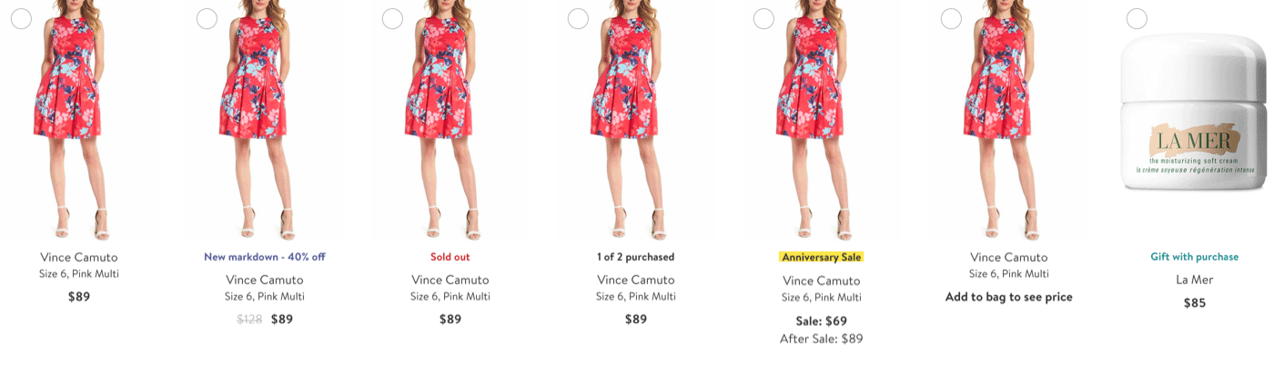
One of the challenges with our product catalog is there are more than 30 possible statuses and enticements including markdowns, event sales, sold out, gift with purchase. To manage this complexity, I designed a system that makes unique differences clear to customers while also avoiding dramatic differences between variants to simplify engineering implementation.
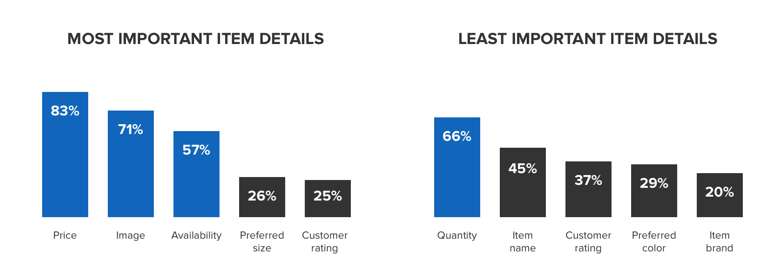
We used customer interviews and usability to define and validate what to include. We first had customers identify the item attributes most important to them on a Wish List unaided. Then, we had them identify their Top 3 most important and Top 3 least important attributes from a list we provided.
Using that data, I explored a variety of layouts to evaluate different compositions, the discoverability of exiting the modal, the ability to see full item details, how to input size and color, and overall height of the modal.
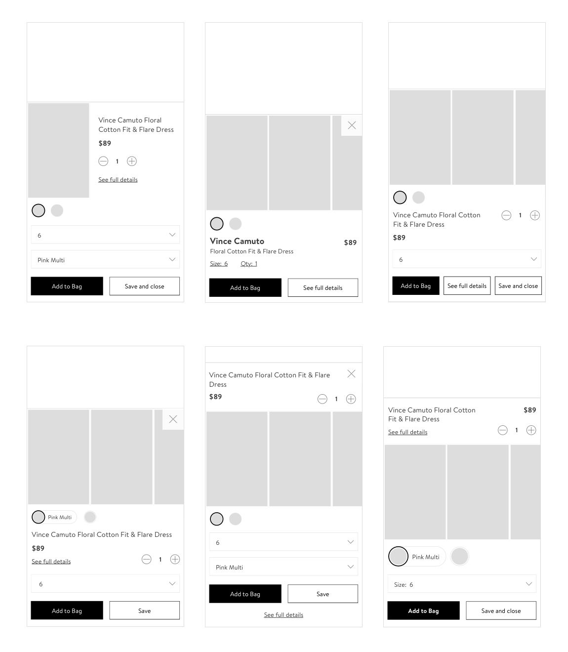
As a team, we felt the final version (below) was the best balance of the goals above. Because customers told us price and images were high priority, I made them easily scannable. Additionally, re-using input controls from our UI library would expedite our engineering effort. We ran an additional round of in-person sessions and the new experience performed very well on usability and customer sentiment.
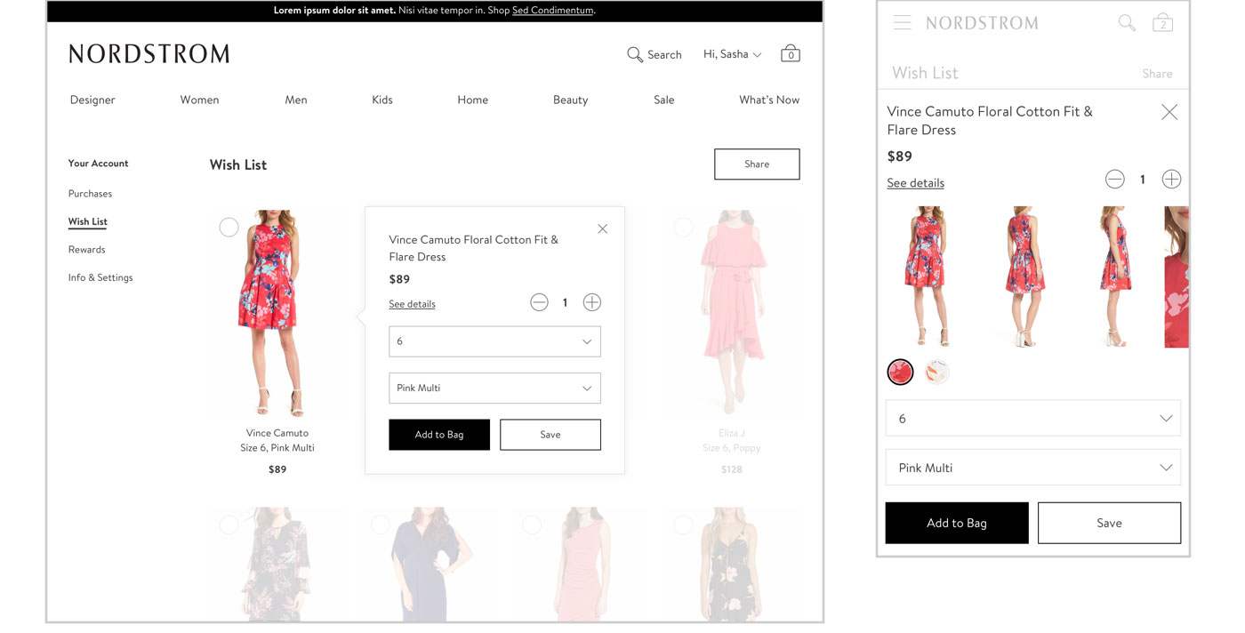
The new multi select functionality also provides a way to purchase multiple items at the same time (one of our primary business goals in the redesign) and in the future, the ability to select multiple items to share at once.
During usability sessions, we validated the discoverability to enter this mode as well as task completion.
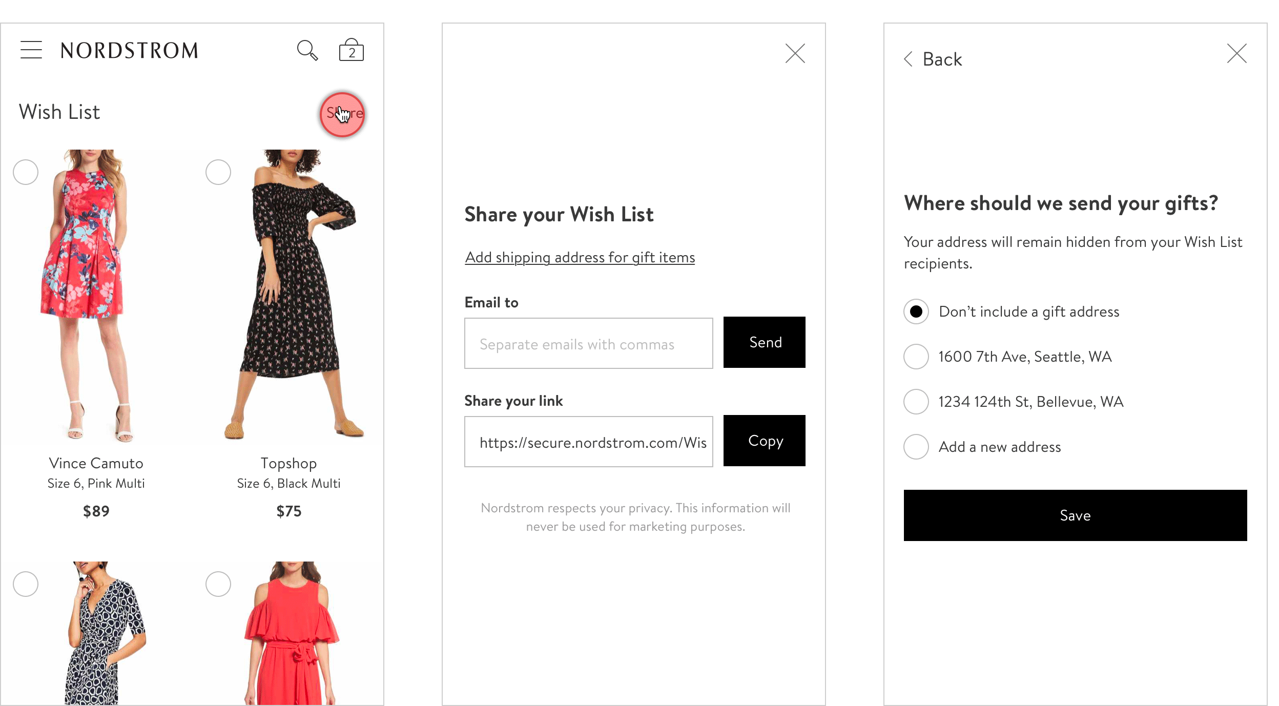
In lieu of rebuilding an underused feature, we introduced new functionality for customers to copy their public URL which can then be shared via text, email, or messaging app. This resonated highly in usability sessions when going through sharing scenarios.
During initial usability sessions, entering the share modal was discoverable. However, customers had difficulty finding a way to set a gift address. Some had also missed the “copy public URL” action.
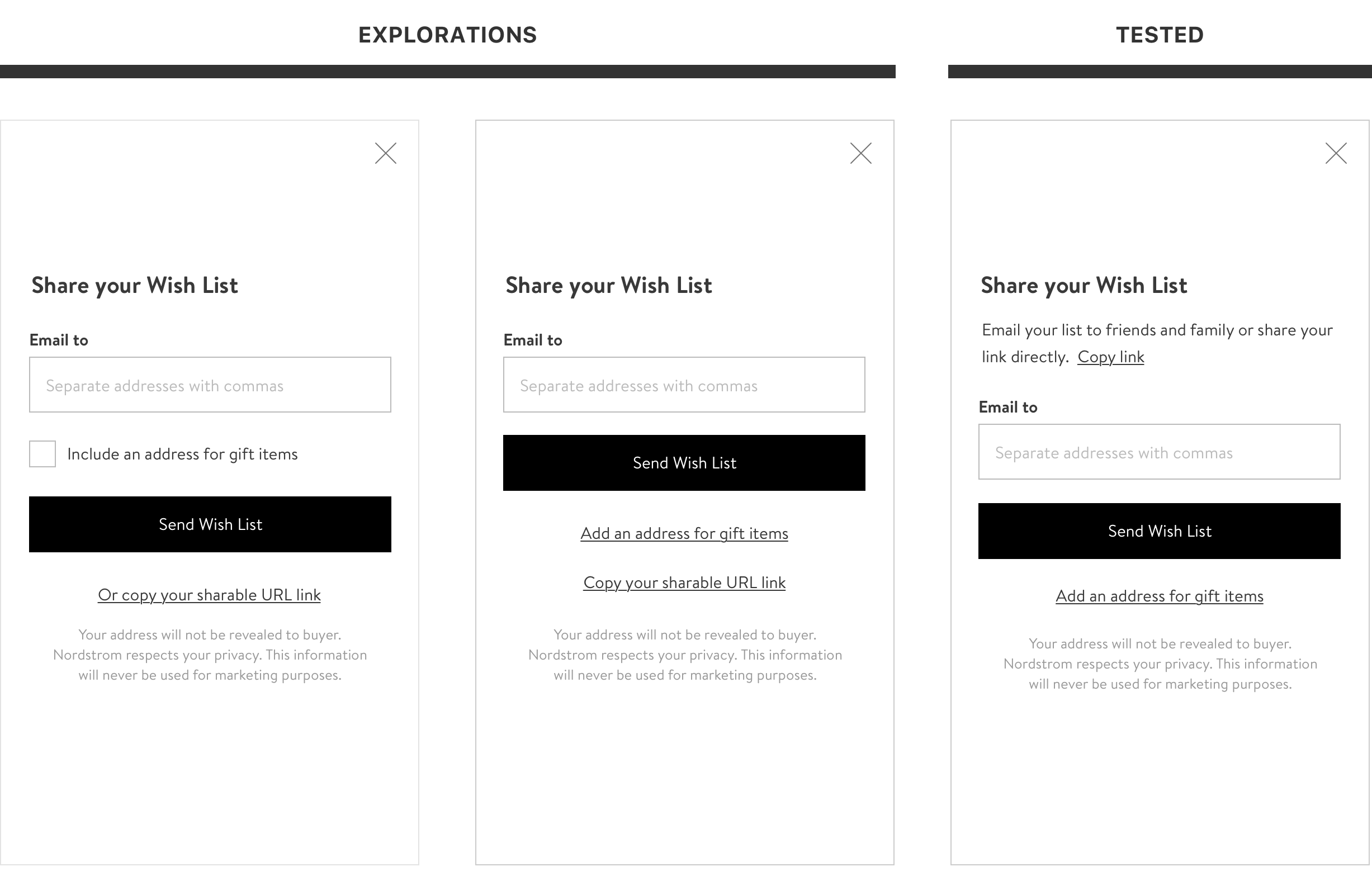
After observing the issues customers had, I redesigned the modal to make those tasks more discoverable. Thankfully in subsequent sessions we saw significant improvement in completion of these tasks.
This release built the foundation for a number of follow up consumer features including notifications, recommendations for sold out items, and the ability to save items directly from the search page. Stay tuned!